
Data Set: Most Popular Dog Breed by Zip Code in Staten Island

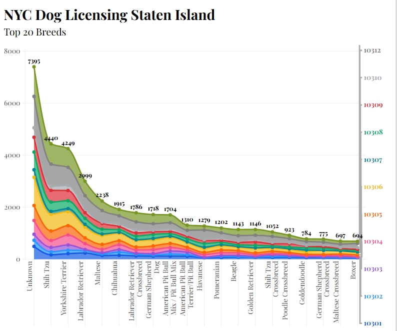
In this data set, we can see the most popular dog breed in the Staten Island Area. Flourish, the data tool I used to create this graph, was very straightforward. When I uploaded my spreadsheet with all the required information, it let me see the data laid out, but not in the most organized way. There are so many options to customize your work to your learning style or your audience’s learning style. At first, it was hard to read the information constructively because it was bunched up in one area, but after making customizations, I made it fit my particular style.

Process

  My first step was to download the data given so I could upload it to the Flourish website. Then I had to decide what graph would represent the best information. I chose an area chart because it spread how my information in a way was visually appealing and easier to interpret. I first went for the bar chart, but it distributed the data in a way that was hard to read and uneasy to the eye, which is the opposite effect I wanted.   The next step was to pick an enticing title so that my audience would want to learn more about the topic. Lastly, spent time looking through the different options Flourish provided and experimented with the way the data could be displayed. 
Artifact

  My artifact is a Flourish visualization showing dog breed data from the Staten Island area. My goal was to make the information from the original spreadsheet easier to compare and understand. The data includes many popular breeds, such as Shih Tzu, Yorkshire Terrier, Labrador Retriever, and Chihuahua, along with an “Unknown” category. Seeing the information visually made it easier to notice differences between the breeds than it was when I was looking at the original spreadsheet. I think I achieved my goal because I was able to take information that originally felt crowded and confusing and customize it into a visualization that is easier for me to understand and share with others. 

Reflection

  This project taught me that data visualization is not just about entering information into Flourish and letting the tool create the final product. I still have to make decisions about how the information should look and what will make the most sense to my audience. I learned that having many customization options can be helpful because different people may understand information in different ways. At the same time, too many options can make the process overwhelming at first. I also learned that I need to think about accessibility and how someone seeing the graph for the first time might interpret it. Next time, I would experiment with more designs before deciding on my final visualization. 

Credits

Data provided as part of the course project. Visualization created using Flourish. Any screenshot included is my own work.

Declaration of AI Use: I used AI to help proofread and organize my writing. The ideas and experiences in this report are my own, and I reviewed the final version to make sure it still sounds like me and reflects my experience using Flourish.
Hip-Hop hit the ground running and never looked back

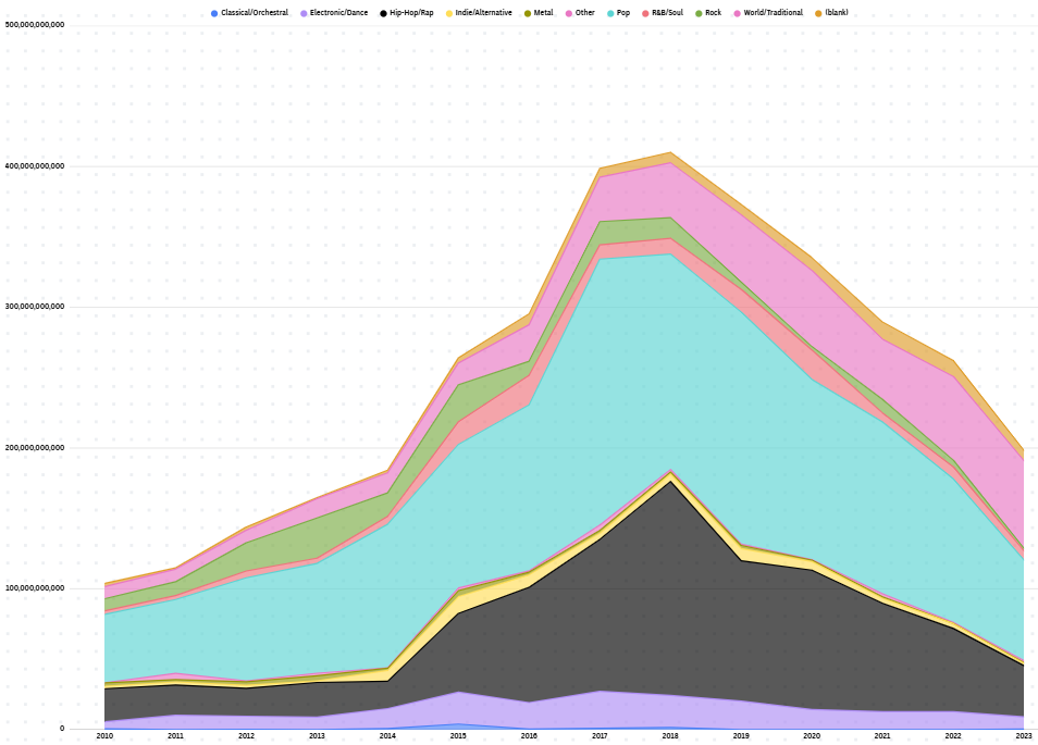
Hip-Hop hit the ground running and never looked back.

Created by: Kaleel Thomas

When I first clicked into the folder for the project dataset options, within seconds the first things that piqued my interest were “spotify” and “aggregated genre by year total streams”. I knew from that point I wanted to explore this dataset. Diving into this dataset, I already knew I wanted to do something closely related to the genre of Hip-hop, so the question I decided to ask was who led in overall streams for the years 2010-2023. I wanted to use this data to not only understand who is dominating the streams between the two but the gaps in streams as well. However, I did consider questions such as how the data is represented, whether any group is unrepresented, and my own personal question:s can a song belong to more than one genre. This is because there have been multiple instances where rap artists and rock artists collab to make a song.

When working to visually represent my dataset, I used Flourish to visualize the data. The first thing I did was take the information from the Excel sheet and put that directly into Flourish. Initially, I wanted to use a pie chart to represent my data, but then I found it was not visually comprehensible. Furthermore, I remember when looking at the types if graph before class that, when doing comparison it is better to use a line graph. Furthermore, I had to adjust the Excel sheet information to only have the year and streams for the genres rap and rock music. Then, resubmitted the data back to Flourish to get a better line graph. The obstacle I ran into was the coloring of the graph because I wanted the background to be black for my graph, but it was just not visually appealing. From here on, after multiple tries, I pivoted, and I attached my Claude to my Flourish to clear up the formatting. What surprised me during this process was how easy it was for the AI to take what I initially created and clean it up so fast to make it visually appealing.

Iryna Tokarchuk. Top Streamed Spotify Songs by year 2013-2023.”
 https://www.kaggle.com/datasets/irynatokarchuk/top-streamed-spotify-songs-by-year-2010-2023 

 “The formatting of my Flourish line graph in Section 3 was cleaned up with Claude Fable 5.1 (Anthropic) using the prompt: ‘Clean up the formatting of this line graph so it is visually appealing.’ I built the chart and selected the data myself; Claude adjusted the colors, title, and subtitle styling, and I reviewed the final chart for accuracy

Data Visualization #1

My visualization is intended to communicate changes in streams for different genres over time. This line graph helps view specific years or the number of streams reached. To simplify the visualization, I removed the “blank” column and reduced the billions to the “B” suffix.

Genres are meant to give listeners a general expectation of how a song will sound. Typically, listeners gravitate towards specific genres to both meet those expectations and to access certain emotional associations. For instance, within this graph, the pop genre is decreasing. This may point to a growing societal disinterest in popular/mainstream culture that the pop genre typically relates to.

As discussed in class, I would hope to further delineate the songs into specific categories. While world/traditional is increasing in streams, the data points mean less if viewers are not able to clearly understand what the genre consists of. The steady increase may be due to a majority of reggaeton streams, which would change the purpose of my title and findings.

My only ethical concern is the inherent focus/bias of the project. I would be interested, as explained above, in more specific genres. This may offer categorizations for the data instances in the “blank” and “other” columns. And I would appreciate data on Spotify’s users themselves, as I imagine most users to be American.

The Rise and Fall of Hip-Hop on Spotify

After taking a look at the dataset and seeing the number of streams for each genre over the years, I decided to ask which genre dominated the streaming era of 2010-2023. I also wanted to find out what year had the most streams, and come up with some reasoning. I noticed that there was no streaming of classical music in some years and I found that to be worth exploring. I wanted to use this data to think about what the shift in music genre trends have been over the years. After asking these questions I did think about how this data is represented and if the sample is biased.That is because Spotify’s user base could skew towards certain countries, ages and income levels so I have to consider how representative the sample is.

I used Flourish to visualize the data. I uploaded the dataset into the software and decided on a line graph because I felt it was better at projecting changes/ growth over time and then I adjusted the space on the x and y axis. I also changed the colors of the lines and the background to be visually appealing and easy to see. I gave the data a title that best explains the visuals and continued to play around with colors and spacing until I found the right features. What surprised me while constructing this was how much the Hip Hop curve changed over the years. I saw a drastic fall that I was not expecting because it dominated and fell drastically.

Line graph showing total Spotify streams per music genre from 2010-2023, with Hip Hop spiking sharply around 2018 before falling.

The graph shows Hip-Hop/ Rap going from about 23 billion streams in 2010 to 152 billion in 2018 and that dominates every other genre on the graph. Not long after, it crashes to 36 billion and ends up being lower in streaming count than traditional music. I think I did well to ensure that the graph really visualized the rise and fall of Hip-Hop streams by enhancing the curve with a gap and flattening all other genres at the bottom (even with adjustments you can see the difference). For limitations, I would say that I did experiment with Flourish to try to expand the gaps between the other genres but they ended up looking flattened near the bottom and in general, they are pretty close to each other, making it harder to trace.

I will say that the graph is very helpful at making numerical conclusion that I can give my own probable reasoning to with the help of additional research. I did not think there was much of an ethical concern that came with this particular data because I do not see any personal information or identity tied to the figures.

Making this chart taught me that visualizations are very important and require intentional detail because every point you place on the graph shares a piece of key information that can bring up questions and thoughtful conversation among the audience. The steep visualization of Hip-Hop streams tells us about its rise and fall, but because it doesn’t tell us why, we as the audience can use this visualization to come up with thoughtful reasons why the genre performed the way it did. If I were to do this again, I would represent the other genres more clearly (possibly creating wider gaps by using smaller units on the y axis).

Credit: Data from Intro to Digital Humanities course. Chart made with Flourish.

Line, bar and pie charts by Flourish team

Brady Rahz Data Visualization Blog #3 Project Report

DATA analysis –
Spotify streams per year

For my module 1 progress report blog post, I will be writing about my efforts to try and track the total number of Spotify streams per year over the past decade by taking the yearly total number of streams per genre and adding them all together. This seemed to be a fairly solid plan, with an achievable goal and usable data to reach it. During the initial graph making stage, I was primarily experimenting with grouped bar graphs, as I thought I could separate each group into a year and then have a final group at the end for aggregate totals, however this led to an abundance of visual nonsense and the graph was just rather difficult to read. 

Graphing

From there I settled on the much more usable area graph, and had substantially better luck organizing by genre and year. This would ultimately end up being the graph I stuck with, as it clearly communicates how much was being streamed and when, though I am curious if there are any other types of graphs that could have gotten the same effect done. Editing the graph in Flourish was a bit of a learning curve, and once I was able to resize my graph I spent most of my time attempting to make it more readable through coloring and text placement.

The Issues

My first main obstacle was trying to save my graph. I had, unlike most people, opened flourish through Canva rather than going directly through Flourish itself. For this reason I had a substantially different UI to work with during the actual graph editing phase, but was also left unable to publish my graph, as I couldn’t find the button for it. I tried a number of other ways to get my graph to appear in my Voices post, such as embedding the link from Flourish’s copy page or downloading the graph and just including it as an image in the post itself. Neither of these worked either.

The SOlution

Eventually I was able to come up with a solution, taking a screenshot of the graph and using a Voice’s template that already had an image included would allow me to replace the image with my own rather than saying it was too large a file or that Voices was incapable of using the selected file. Not sure why it wants to be like that but it worked out in the end.

The Conclusion

The actual process of gathering data and trying to represent my findings seems to be straightforward enough, and I think I have a generally pretty good understanding of how I should be trying to present my data in a clear and concise manner. The real difficulty for me came in trying to learn how to use Flourish and Voices, with Flourish being a new piece of software I just don’t have much experience with, and Voices limiting my ability to post pictures for reasons I still need to use work arounds for. Hence the small graph photo rather than an actual readable sized graph photo. Still learned a lot from it though.

Most Popular Dog Breed By Zip Code in Staten Island, NY

This graph aims to show the most popular breed by Zip Code for Dogs in Staten Island New York. Now, when I first put this data into Flourish, most of the chart options that were presented were not ideal. There was too much visually going on, sometimes the charts just left things out, and it really struggled with what the zip codes actually represented in the data. Eventually I decided on a Bar Chart that allowed for someone to switch between the zip codes( Top Left) and see the information. Not only did it, mostly, fix the issue of too much information at once it allowed for all the numbers and names to be scene clearly which was big issue with the other charts and graphs generated. Unfortunately the public the version on Flourish is too wide for voices and some of the names overlapped. This was mostly rectified by placing the alignment of the chart to the side. Overall Flourish does have a learning curve but once you get past that you should be able to figure most things out, eventually.

The question that came to mind when first scanning through the excel sheet was: Are more breeds preferable in certain regions than others? I was looking to see if some regions had certain preferences and if I could perhaps find a pattern. For example, in most places the Shih Tzu is in the top five, more often the top three or two. Now, there a few quirks finding the answer to this. Seemingly most people have no clue what type of dog they own and since unknown is category it sits at the top for almost every region. Another aspect of the question difficult to answer is the “why” of it all. I have no information on how big the regions are or the financial status of them. However, the basic essence of my question is clearly answered by the chart. Rather then keep the names in the same order on the spreadsheet (though if you are curious the order at the top is the same order as the spreadsheet) I made it so the names would be sorted by value. The highest at the top and the lowest at the bottom. In retrospect taking away some of the zip codes at the end that have like no data would probably help clean things up.

Ethical questions are actually not too much of an concern. Yes, there are zip codes listed here but other than that there is no specific identifying information here for anyone . It’s seemingly anonymous. No private information, names, full addresses. The only thing is perhaps if the data collected is technically public information and where di they receive it? From Staten Island? Pet stores? No generative AI was used in the making of this chart.