
DATA analysis –
Spotify streams per year
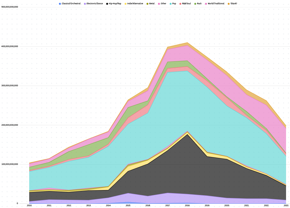
For my module 1 progress report blog post, I will be writing about my efforts to try and track the total number of Spotify streams per year over the past decade by taking the yearly total number of streams per genre and adding them all together. This seemed to be a fairly solid plan, with an achievable goal and usable data to reach it. During the initial graph making stage, I was primarily experimenting with grouped bar graphs, as I thought I could separate each group into a year and then have a final group at the end for aggregate totals, however this led to an abundance of visual nonsense and the graph was just rather difficult to read.
Graphing
From there I settled on the much more usable area graph, and had substantially better luck organizing by genre and year. This would ultimately end up being the graph I stuck with, as it clearly communicates how much was being streamed and when, though I am curious if there are any other types of graphs that could have gotten the same effect done. Editing the graph in Flourish was a bit of a learning curve, and once I was able to resize my graph I spent most of my time attempting to make it more readable through coloring and text placement.
The Issues
My first main obstacle was trying to save my graph. I had, unlike most people, opened flourish through Canva rather than going directly through Flourish itself. For this reason I had a substantially different UI to work with during the actual graph editing phase, but was also left unable to publish my graph, as I couldn’t find the button for it. I tried a number of other ways to get my graph to appear in my Voices post, such as embedding the link from Flourish’s copy page or downloading the graph and just including it as an image in the post itself. Neither of these worked either.
The SOlution
Eventually I was able to come up with a solution, taking a screenshot of the graph and using a Voice’s template that already had an image included would allow me to replace the image with my own rather than saying it was too large a file or that Voices was incapable of using the selected file. Not sure why it wants to be like that but it worked out in the end.
The Conclusion
The actual process of gathering data and trying to represent my findings seems to be straightforward enough, and I think I have a generally pretty good understanding of how I should be trying to present my data in a clear and concise manner. The real difficulty for me came in trying to learn how to use Flourish and Voices, with Flourish being a new piece of software I just don’t have much experience with, and Voices limiting my ability to post pictures for reasons I still need to use work arounds for. Hence the small graph photo rather than an actual readable sized graph photo. Still learned a lot from it though.
“Is the growth you’re seeing in total streams telling you something about music listening, or mostly about Spotify’s user base growing over the decade? How would you separate those two?”