
Most Popular Dog Breed By Zip Code in Staten Island, NY

This graph aims to show the most popular breed by Zip Code for Dogs in Staten Island New York. Now, when I first put this data into Flourish, most of the chart options that were presented were not ideal. There was too much visually going on, sometimes the charts just left things out, and it really struggled with what the zip codes actually represented in the data. Eventually I decided on a Bar Chart that allowed for someone to switch between the zip codes( Top Left) and see the information. Not only did it, mostly, fix the issue of too much information at once it allowed for all the numbers and names to be scene clearly which was big issue with the other charts and graphs generated. Unfortunately the public the version on Flourish is too wide for voices and some of the names overlapped. This was mostly rectified by placing the alignment of the chart to the side. Overall Flourish does have a learning curve but once you get past that you should be able to figure most things out, eventually.

The question that came to mind when first scanning through the excel sheet was: Are more breeds preferable in certain regions than others? I was looking to see if some regions had certain preferences and if I could perhaps find a pattern. For example, in most places the Shih Tzu is in the top five, more often the top three or two. Now, there a few quirks finding the answer to this. Seemingly most people have no clue what type of dog they own and since unknown is category it sits at the top for almost every region. Another aspect of the question difficult to answer is the “why” of it all. I have no information on how big the regions are or the financial status of them. However, the basic essence of my question is clearly answered by the chart. Rather then keep the names in the same order on the spreadsheet (though if you are curious the order at the top is the same order as the spreadsheet) I made it so the names would be sorted by value. The highest at the top and the lowest at the bottom. In retrospect taking away some of the zip codes at the end that have like no data would probably help clean things up.

Ethical questions are actually not too much of an concern. Yes, there are zip codes listed here but other than that there is no specific identifying information here for anyone . It’s seemingly anonymous. No private information, names, full addresses. The only thing is perhaps if the data collected is technically public information and where di they receive it? From Staten Island? Pet stores? No generative AI was used in the making of this chart.
Black Super Bowl = Genre Streams???

chart visualization

–

Module 1 Project Report: Data Visualization

When first introduced to the data, my first question was this: is there a strong correlation between dog breed and name? I hoped to learn how to effectively communicate information of this nature through a legible graph. Flourish as a tool seems to be a largely egalitarian one, with its shortfalls stemming from its internet-based nature, rather than a severe design flaw. It’s easy enough to use, but more complex tasks have a learning curve.

When I first uploaded the data to Flourish, most of the charts created for me were nigh-unreadable. Due to the nature of the data, being more qualitative than quantitative in what it measures, the software seemed to be less equipped for such a task. The animated bar charts moved at a speed and severity that was wholly unpleasant to look at, and the pie charts looked like irises given their extreme amounts of subdivision. A heatmap seemed to be the best choice, as it was able to effectively communicate the density of both name and breed in a relatively readable format. I tried to see if there was a way to get the numbers within the chart to display without hovering one’s mouse, but I was unsuccessful in this task.

Here is the heatmap in all of its glory. My goal was to display as much information as possible while still remaining relatively readable, and I feel that I was able to accomplish this. Comparing it to the spreadsheet itself, I realize that the heatmap is little more than a reprinting of the data, this time represented with colors rather than numbers. This decreases the amount of processing power one needs to expend while looking at said spreadsheet. As well, by looking at the distribution of the “heat” on the “map,” we can see a cluster of larger numbers in the bottom left, directly indicating a connection between breed and name. A more even distribution would not have such pockets of deep blue.

In the process of making this heatmap, I realized that, sometimes, it’s okay to ignore some of your data. While, of course, I did not do this, I do think that if this graph were to be shown on a slide rather than on a webpage, where it can be interacted with, loping off some of the rows and columns would not be a terrible idea. As well, I realized that, while tools like Flourish are a godsend for amateur data visualization, more complicated and specific tasks can be prohibitively complex. I at times felt like I was learning to read, and my only book was Finnegans Wake. If I find myself needing to use this resource for a more intense and professional environment, I would likely spend some more time learning the basics.

I did some fruitless research on whether or not I could display the actual numbers along with the colors, and the relevant Flourish blogpost can be found here. I did not use any generative AI in the production of this blogpost or in the creation of my chart, however I did use the built-in spellcheck on WordPress.

Data blog post

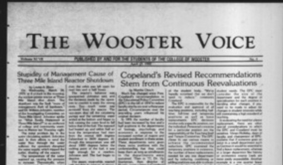
A picture of a Wooster Voice edition
The Wooster Voice. (2026). The voice: 1971-1980 | “The voice” student newspaper collection | the college of Wooster. Wooster.Edu. https://openworks.wooster.edu/voice1971-1980/

After looking at the digitized Wooster Voice archives I would be interested in exploring how exclusive the newspaper was to the college community back when it was the print version only. I would also want to look at the kinds of topics it covered and content distribution (eg. whether political news was more than campus gossip). I was curious about who the Voice’s target audience is today versus who it was written for and how that affects exposure to the campus community. These questions are important because they reveal how students have made sense of their experiences on campus and how student culture has evolved. Largely, in DH, they give a range of possible data points that can be researched.

For my questions, I would organize my spreadsheet so that each row represents a single article from the Voice archives. For example, with the content distribution question, each column would have publication date, title, author, topic category (politics, entertainment, arts, sports, greek life etc). I could also do how many student features, their class year, major, and the kind of topics portrayed. For the vocabulary, i would use short words, category kid of labels like politics, alpha, gamma, greek, basketball, administration, student life etc. Anything that makes SEO efficient and also just to have each article coded with specific words/terms.

Data privacy is a significant concern in this project because exposure has changed from print to digital and that comes with ethical concerns especially regarding student features from the past. They may not have anticipated their college time to be digitized years later and very accessible. My spreadsheet would include identifiable information like names and quotes so i would probably ask whether it is necessary to record very personable information or using pseudonyms for certain topics where someone may have said something very personal and exclusive to campus community like the gossip section (that maybe they don’t want someone outside to know).


Blog 2: Turning The Wooster Voice into Data

Some interesting questions in my group were: What is deemed important to tell the students? What topics are repeated? Who is writing/contributing the most to The Voice?

These are interesting because it gets into the reason The Voice exists, how it is used, who it is for, and if it is informative. Another significant benefit is being able to look at these records in the future, providing historical data for study.

To organize my main question of what is talked about in the voice, I would break it down:

My rows would include:

  • what week/ time the voice article I am looking at is.

What the columns would be:

  • Who is the author?
  • What is the main topic of the week?
  • Was this topic repeated in another week?
  • Is this a topic related to the school or a global event?
  • Was a day or week missed?

Some keywords would be for the rows, such as global or local, or repeated or single post. 

For data privacy, I would be sure to get permission from the authors to use their work in my studies, as their names are attached to the writing. I do have concerns about authors being targeted about topics that may be less agreed upon. The information is publicly posted already; however, if any personal information is in the writing, I would keep it vague.