As I approached this exercise, one line of thought from the readings guided my decisions: “Design intentionally communicates to a particular audience. It starts from a problem, presents solutions, and finds opportunities” (Kemerling). With that in mind, I wanted the design to make sense, and I wanted most, if not all, of the design choices to be intentional.
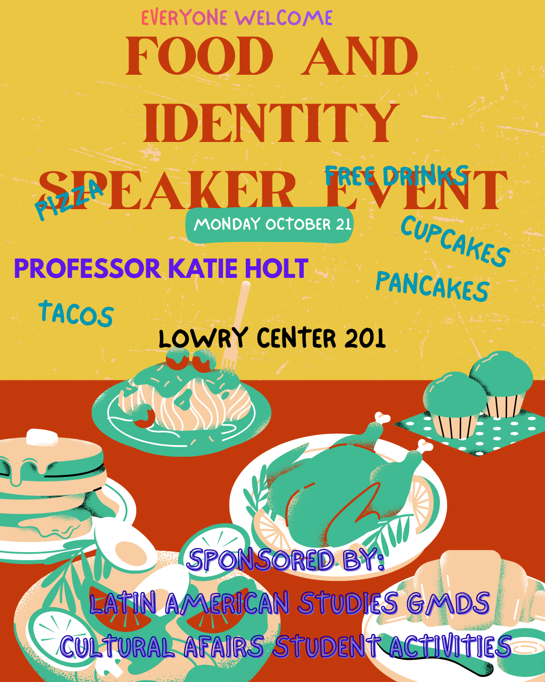
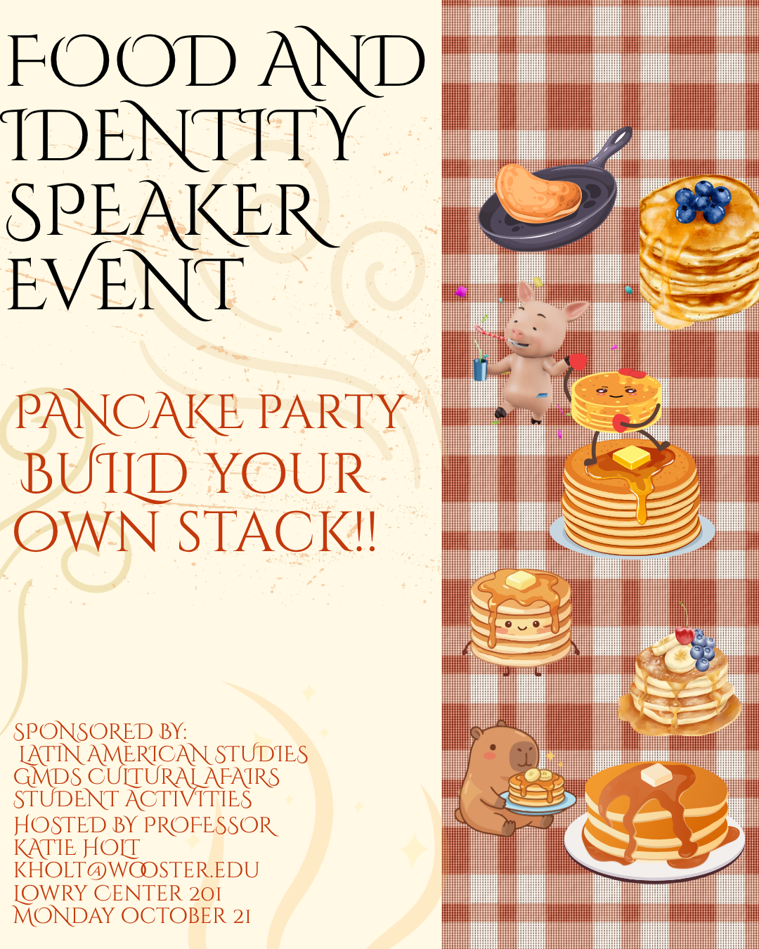
ORIGINAL IMPROVED
The “bad” design created by Dr. Holt had a lot of interesting decisions. For instance, the text was distracting in several ways: text boxes overlapped and were oddly aligned, and the color differences seemed unintentional. I also felt that the background colors could be improved – I appreciated the split colors since they resemble a table setting for the food, but I do not think the colors communicated anything interesting. The last major issue I saw was the disconnect between the foods listed by name and the foods shown.
When creating the improved design, I had a few thoughts in mind that I wanted to implement. I knew that I wanted to clean up the information to make it easier to understand quickly, mainly so that a student could understand the gist of the event at a glance. First, I grouped all the text information as relevant: I made the title the only text on top, I put the metadata of the event at the bottom, and I included the “pull” activity with the pancake party. For the 1/3 visual background split, I chose to use gingham to resemble a picnic setting in place of the red table in the original. Since I chose the name “Pancake Party.” I wanted to showcase that properly with loads of different kinds of pancakes and some dancing friends.
No generative AI was involved in the creation of this blog post.
The first image was created by Dr. Holt. the second image was created by me.
I really like your design; I think it is cohesive; however, I have two pointers. The font chosen is very thin and swirly, which makes it hard to read when it is spaced closely together. The plaid background behind the pancakes is a similar color scheme, which can make the graphics blend in a little.
Hi Pierce, my favorite part of your design is the color pallet. The colors are giving off a warm and welcoming environment which is great considering you want people to come to the speaker event. The only negative is the spacing in the bottom left corner. It’s a bit hard to read, so even a 1.0 spacing between the words could make a huge difference.
Your design is great, and all the pieces work well together.