
The ads below are trying to persuade students to study abroad in New Zealand. It gives several reasons why they should study abroad and what resources to contact.
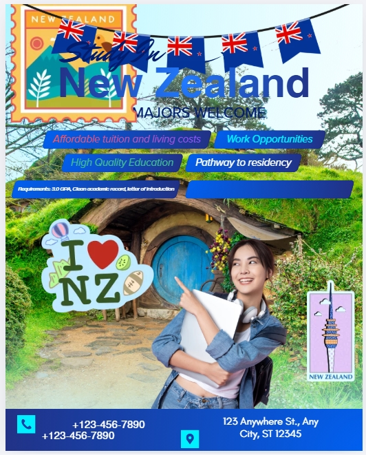
- Pictured above is the “broken” image that has zero reconstructing done to it. The image credit goes to Katie Holt.

- Pictured above is my “improved” image created by Annie Henegar.
Reflection
When I first saw the original design, I couldn’t figure out what to focus on. There were a lot of different colors, logos, and shapes that were not meshing well together. The alignment of text and images on the poster were off, giving it a non-aesthetic look. There were spaces with missing information, and the size of certain images didn’t look right with the layout of the page.
My goal for improving this page was to make it more coherent and easier to read and look at. My audience for this post is students looking to study abroad in a foreign country and my goal is to persuade them to come to New Zealand. I kept some of the graphics from the original post, while placing and sizing them in a way that made more sense with the layout. I took away the background because it was adding too much to the page and it was simply unnecessary to have. I aligned the contact information and the New Zealand flag to make it more visually appealing. I wanted a center image to grab the attention of the viewer, so I added an actual map of New Zealand, while color matching it with other text and images on the page.
The only obstacle I encountered was time, because sometimes you just have to sit and think about what would look best. That can also mean figuring out which colors and fonts go best together, so taking the time to test different styles.
The new design portrays the information as straight forward, so a student that is Interested in studying abroad in New Zealand, they can see the benefits and be able to receive more information about the topic.
I did not use any Generative AI in my graphic design or my Voices Post.
I love how you simplified it to make it look cleaner and so my eyes don’t get confused about what I’m reading