
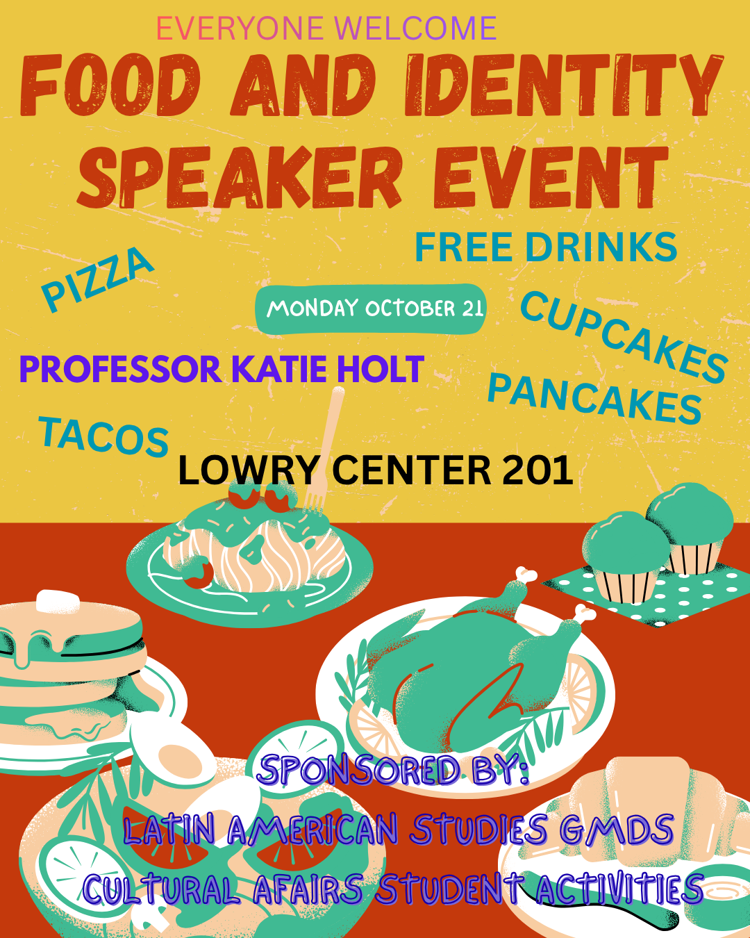
Before:
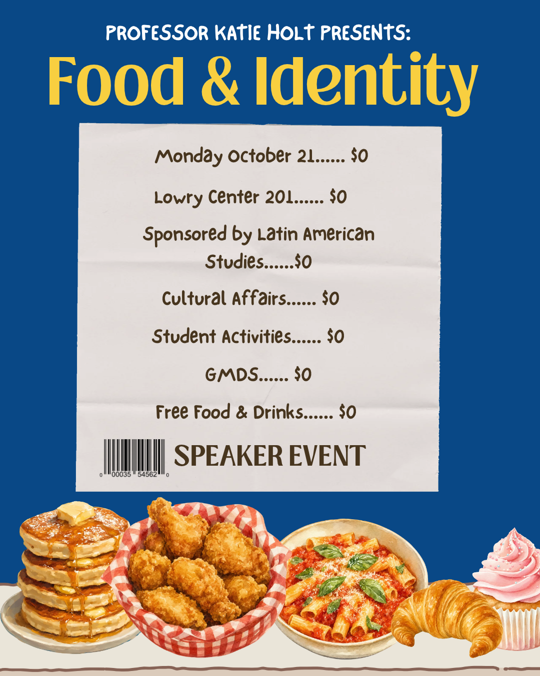
After:
Message: A poster communicating an upcoming speaker event on Food and Indentity by Professor Holt. Located at the Lowry Center RM 201 and sponsored by Latin American Studies, Cultural Affairs, Student Activities, GMDS. It is an event with free food and drinks where everyone is welcome!
Problem with the original design: The typography is inappropriate for reading because of the inconsistent font type and illegibility of the colors. There is no uniformity in the presentation/ combination of colors. The colors are also creating some clash and are not accommodating people who are colorblind or unable to clearly see the green and red colors.
Improved version: The new design has accessible/ inclusive color choices, consistency with the typography, legibility, harmony and an appropriate use of space, balance and composition.
Process: I started by ignoring the colors because I wanted to figure out the harmony and composition. I took away everything from texts to elements and thought about the foods to use and where to place it. Once I figured that out, I addressed the main text and then I added a “picnic table” under the food. Then I thought more about the food concept and felt it would be creative to go with a “menu” style. I left the color scheme for last because I had a hard time thinking about what would compliment and contrast the foods on the poster. I think blue and yellow was a good choice because it is much calmer on the eyes but also has an eye catching effect.
Challenges: The challenge was choosing a color scheme and also the placement of the food because I was indecisive about it.
Links to class discussion: I used the blogs “Good design visual explained” by Kelley Gordon and “Design elements and principles” by Canva to work on the improved version and to explain the changes (like composition, harmony etc).
AI use: No AI was used in writing this post.
Citation: Gordon, K. (2025, November 14). Good visual design, explained. Nielsen Norman Group. https://www.nngroup.com/articles/good-visual-design/
Stribley, M. (2012). Design elements and principles – tips and inspiration by CANVA – learn. Canva. https://www.canva.com/learn/design-elements-principles/
Katie Holt (2026). Canva slides for lab- please wait to use these!- https://moodle-2627.wooster.edu/mod/url/view.php?id=23466
I like your design and the idea of the receipt. The colors and font chosen make it easy to read and is colorblind accessable. I also like that the food shows off the event but is away from the text to make it easy to read.