
We had the fun exercise to fix/improve a poster created by Professor Holt or another template that was just terrible. I decided to choose the Global Food systems poster infographic.
Broken Improved
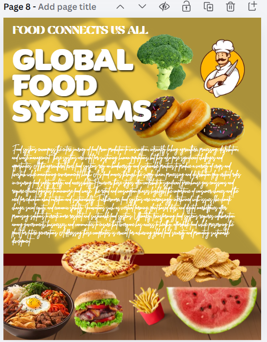
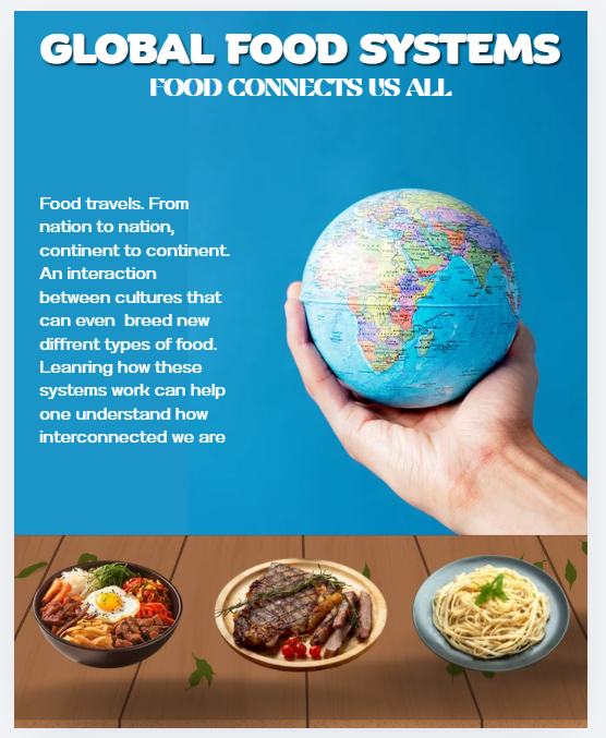
Let’s start with what I got rid of. Firstly the original was….noisy. A lotta food items and a chief ,on the table and next to the title. So everything except for the dish on the bottom left was removed and replaced with only two other dishes all lined up on the table. Next, was fixing the text, not only was it too small and in an unreadable font but also there was just too much text in general. So that was removed and replaced with a new statement thought up by yours truly in a much more readable font. Lastly was changing the color and removing the weird window effect from the background and shifting the table up. Blue was chosen after it was decided the infographic would feature the planet earth to more firmly connect to the “GLOBAL” part of the “Global Food Systems”. The blue of the earth being slightly lighter than the background color makes sure it doesn’t disappear into the background. Two colors makes sure that eyes are processing too much information. Overall this was an experiment in simplification and especially composition, the arrangements of elements. For example where to place the globe, original it was center frame , however that didn’t leave enough room left for the text, so it was decided it would be on the left and the text on the right.
Gordon, Kelley. “Good Visual Design, Explained.” Nielsen Norman Group, April 9, 2026. https://www.nngroup.com/articles/good-visual-design/.
Design elements and principles – tips and inspiration by CANVA. Accessed October 22, 2026. https://www.canva.com/learn/design-elements-principles/.
No generative A.I. was used in the writing/creation of this post