Post 4: Project proposal (week 6)

1) Tentative topic:
LLM use in college academics, specifically how college students use AI tools such as ChatGPT for their academic work.

2) Research question:
How does the use of LLMs for academic work compare between students who use LLMs and students who do not, particularly when looking at academic performance and how students use these tools?

3) Primary Digital Humanities track:
Data science/data analysis. I am interested in using data to compare students who use LLMs with students who do not and creating visualizations to present the results.

4) Preliminary sources:
I plan to use course readings and discussions about LLMs and AI in academic work, along with data about student LLM use and academic performance. I will also look for additional sources about how college students use LLMs and how AI is being used in education.

5) Group members and responsibilities:
I currently plan to work individually. I would be responsible for finding or collecting the data, organizing and analyzing it, creating visualizations, and presenting results.

6) Questions I have:
I am wondering what an appropriate amount of data for this project would be and if I should get my own data from students or use an existing dataset. I also want to know how broad the comparison between students who use LLMs and students who do not should be.
Module 2 project report: LLMs

After considering the MIT report on generative AI in higher education and thinking about how I use Ai in my own work, I think that college students should use AI, but only as a tool to help them learn. The MIT report found that “Brain connectivity systematically scaled down with the amount of external support” (Kosmyna et al., 2025). It also found that It also found that “the LLM group’s participants performed worse than their counterparts in the Brain-only group at all levels” (Kosmyna et al., 2025). These made me think about how using AI too much could affect how much students actually learn.

For my process, I thought about how I use AI for school. I think it’s useful for explaining things I don’t understand, organizing information, studying, and checking work to see if answers are correct. I also decided that I wouldn’t use AI to write an entire assignment that is supposed to show what I understand. I wanted to see how AI could help me learn without doing the work for me.

Artifacts

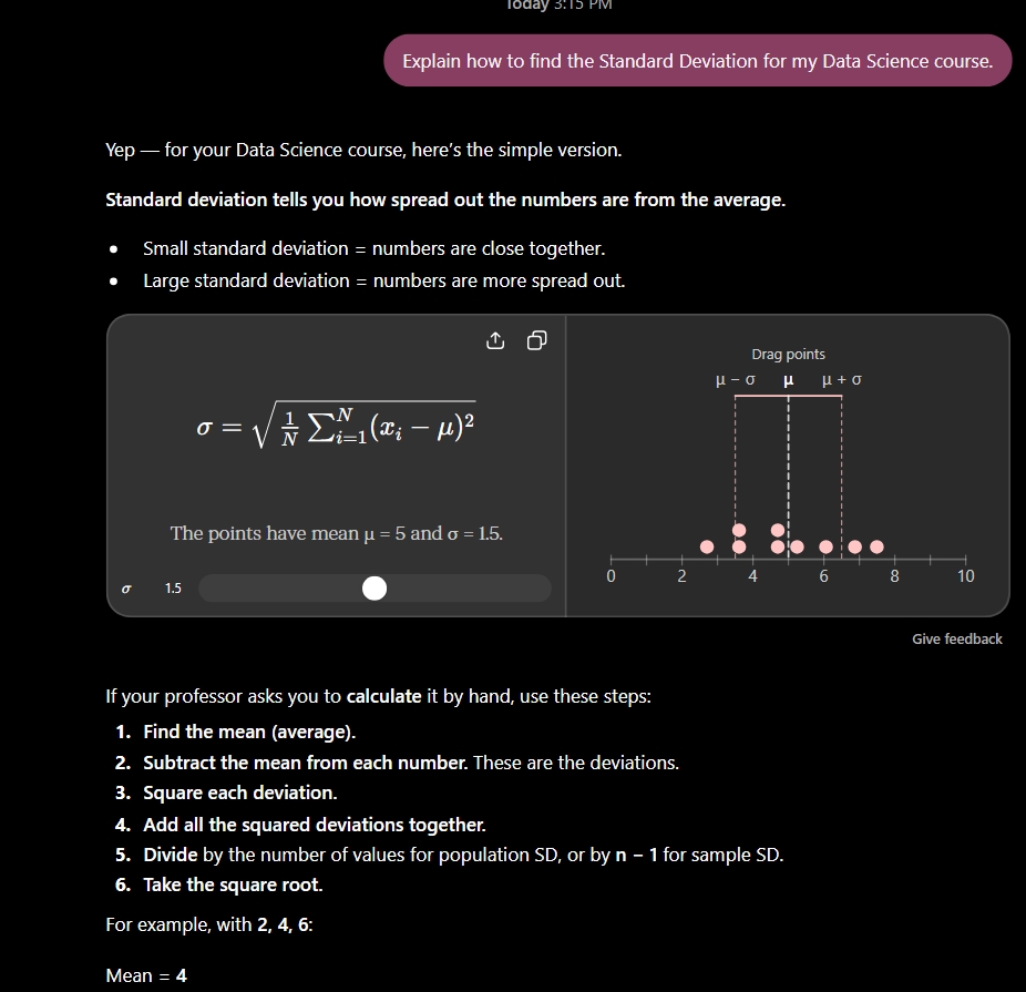
I asked Chat GPT to explain how to find the standard deviation for a Data Science course and give me an example. I used the response to help me understand the concept instead of just using AI to complete my assignment. It shows how I can use Ai to help while still doing my own work.

This project showed me that AI can still be useful depending on how I use it. It can help me understand things faster, but it can also make it easy to stop thinking for myself. I also leasrend that studets do not al have the same access to AI or the same understanding of how to use it. Going forward Ill continue doing the work myself and use AI when I actually need help instead of letting it do the work for me.

Kosmyna, N., Hauptmann, E., Yuan, Y. T., Situ, J., Liao, X.-H., Beresnitzky, A. V., Braunstein, I., & Maes, P. (2025). Your Brain on ChatGPT: Accumulation of Cognitive Debt when Using an AI Assistant for Essay Writing Task. MIT Media Lab.

Post 3: LLMs (week 4)

A takeaway I have for the week is that I never knew what the GPT stood for, and it changes what I think of AI and how to use it in the future. Transformers can look at patterns in the words to predict what is next, so it’s not even checking if the info is true or not. It changes my perspective because some people trust AI to give them info for important things like school work, some journalism and more things that can’t afford the problems that come with the false info you could be getting from AI just because it sounds good. 

One more thing would be the bias part from the How AI Image Generators Make Bias Worse article because it said that AI picture generators can repeat stereotypes from their training. For example, the small activity we did in class where me and my partner both typed in a prompt to give us a caretaker on two separate models and they both gave old white women with a white caretaker with the word caretaker on it. Or it can look like its connecting high paying jobs with lighter skinned people and men, but connecting lower paying jobs with darker skinned people and women. That changes my perspective not just for me personally but for companies and jobs in the future. 

Overall, I just plan to keep using AI when i need it and only as a resource to check work and help stay organized because it’s not really as trustworthy as people think.

Sources:

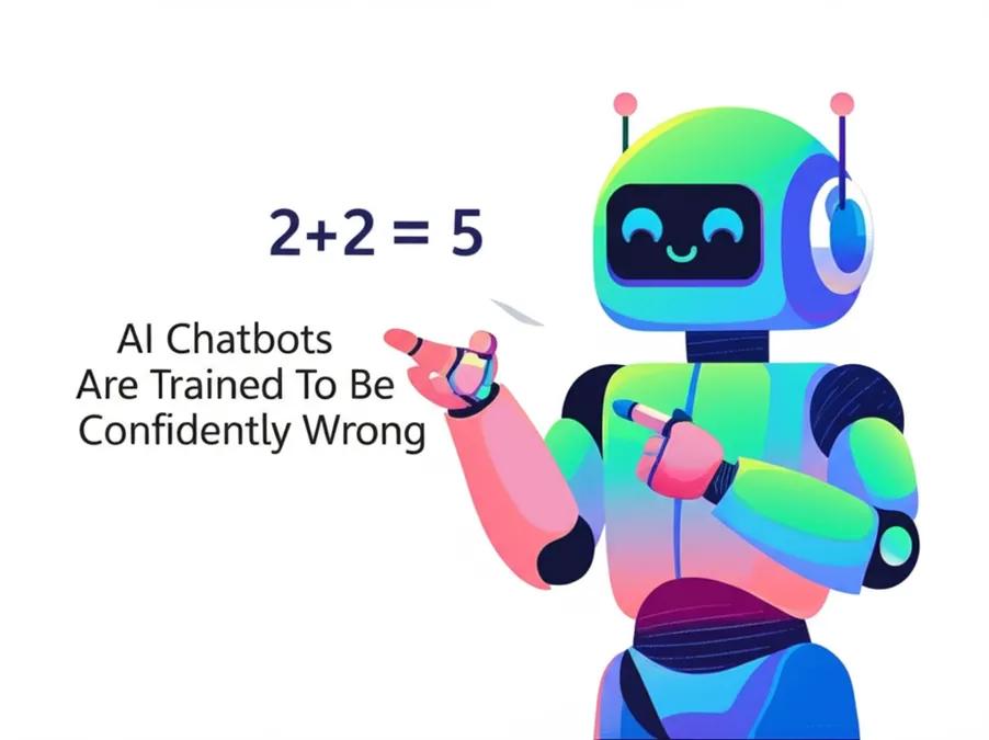
Picture Citation: Prompt “Give me a funny picture to show how AI can be wrong”, ChatGPT, 2026

3Blue1Brown. (2024). Transformers, the tech behind LLMs | Deep Learning Chapter 5, YouTube. Transformers, the tech behind LLMs | Deep Learning Chapter 5

Cheung, J. (2023, August 21). How AI image generators make bias worse. London Interdisciplinary School. How AI Image Generators Make Bias Worse

Module 1 project report: data visualization

My goal for this project was to use the Spotify data given to us to see how streaming changed over different music genres between 2010 and 2023. I wanted to make a clear visualization that would make it easier to compare genres and notice the changes over time. I also wanted to understand how the way data is organized affects what we can learn from it. The dataset already puts music into categories like as Pop, Rock, Hip-Hop/Rap, Metal, and R&B/Soul, so those decisions shape the kinds of questions I can ask about music and popularity.

I put the Spotify CSV data into Flourish and looked at different graphs to display it. I thought that a line chart made the most sense because the data is organized by year and I wanted people to be able to follow changes over time. I also spent time changing the colors so that each genre had its own color and adding a legend at the bottom so the colors were easier to understand. One problem I noticed was that some genres, especially Metal, had much smaller stream totals than genres with much larger numbers. It made some of the smaller categories harder to see. I had to think about how to make the visualization easier to read without changing the scale in a misleading way.

My final visualization shows total Spotify streams for different music genres from 2010 through 2023. I used a line chart because it allows the viewer to follow each genre across the years and see how streaming patterns changed. I used different colors for the genres and placed the key at the bottom so viewers can identify each line. I also used “year” as the x-axis and “total streams” as the y-axis. My goal was to make the graph simple enough that someone who has never seen the dataset could understand what it is showing without needing a lot of explanation.

This taught me that choosing a visualization is not just about making a graph look good. The type of graph can change what a audience notices and how they take in the data. I also realized that the categories in the dataset affect the questions I can ask. For example, music can be categorized in different ways, and different genre definitions could give different results. Removing some of the categories also helped make my visualization less crowded and easier to focus on. At the same time, I learned that removing information can affect what the audience is able to see, so those choices need to have a reason behind them. If I did this project again, I would spend more time testing different designs and finding ways to make smaller genres easier to compare while keeping the graph accurate.

Data source: https://www.kaggle.com/datasets/irynatokarchuk/top-streamed-spotify-songs-by-year-2010-2023

Post #2

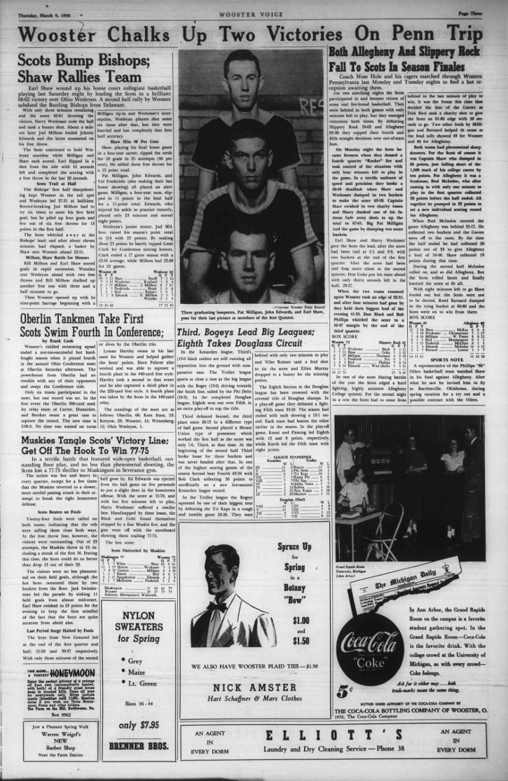
Based on what my group talked about in class I think that we can ask questions like how do the topics that are talked about change over time. If you look at what they were talking about over the years you can see that at the time things like sports, actual student life and complaints, and politics or big events in the country were showing up way more than anything else. It’s interesting because it shows what was more important at different points in Wooster’s past because you see a difference in what students talk about today compared to what they talked about back then.

Front page of The Wooster Voice newspaper from March 9, 1950

The Wooster Voice (1950) [Newspaper page]. 9 March 1950. The College of Wooster Open Works. https://openworks.wooster.edu/voice1941-1950/211. Rights information: The College of Wooster Open Works.

If I was to make a spreadsheet for this, I would make every row represent an article. The columns would be things like the date, the title of the article, the topic or the type of article, and the people or the groups that are being talked about. The hardest thing would be picking what info is actually worth putting on the spreadsheet. 

For privacy I think I would just make sure I am careful about what I use and how I’m using it, I wouldn’t really use anything I don’t have permission for unless it’s just open to the public. I will base how deep I go into using whatever info I am using based on how personal the information is. 

Post 1

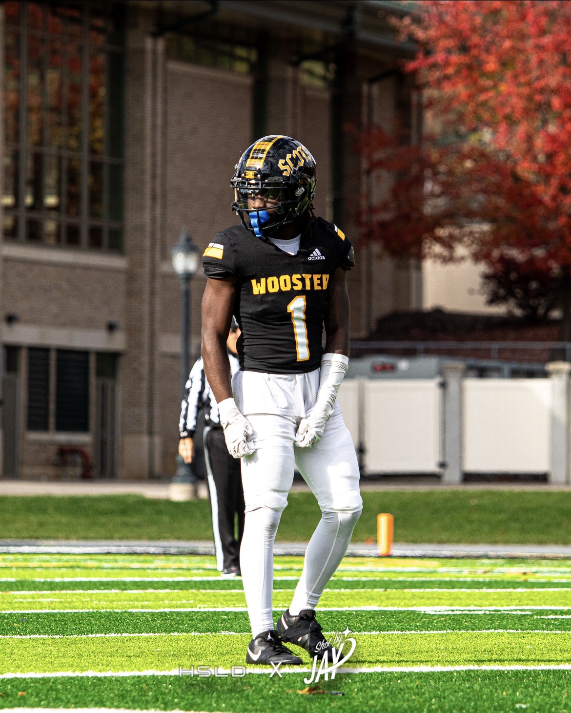
Im Damion, Im from Shaker Heights Ohio and I like to play football here

My muddiest point would be not fully knowing how digital tools are related to the humanities part of the course