Process
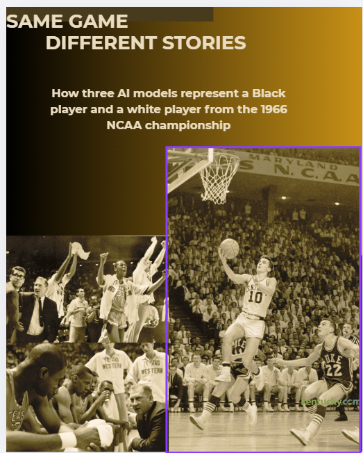
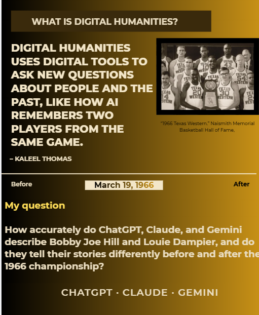
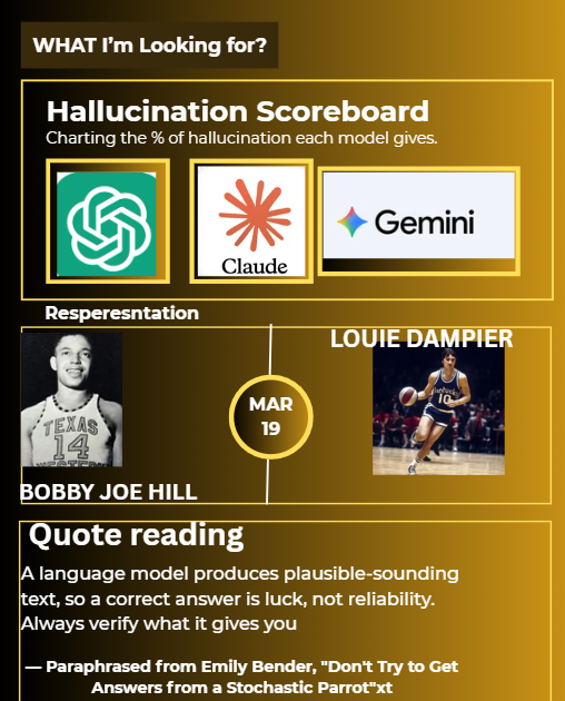
When creating this visual design, I first wanted to settle for using the pre-built digital design templates within Canva. However, even though the template was very clean and visually appealing, it just wasn’t what I was looking for. From there, I went ot browse the web to look at good digital humanities promotion displays. I found a good template on Google; however, I could apply it to Canva, and I am also just not proficient enough to do so. From there, I just decided to see what I could create. I did put what I created into Claude to help me make some improvements.
Artifact
Reflections:
After getting help from Claude, I felt better. I added a brownish-yellow background to give it a soothing look. This is what I created within the time span of the deadline. Now, taking a look at what I created vs what everyone else created, I definitely would say change the color bc it does give the feeling I want to click on this and tune in. The first two slides I can say I am proud of in a way because I had Claude give me step by step guide in which I follow and found more shortcuts to use when navigating the tool. Furthermore, I notice that Canva is very similar to PowerPoint, but Canva is heavy on design and personal projects, and PowerPoint is more for business proposals. I want to point out things I can improve on, like the consistency of spacing and the fonts
Declaration of AI
“Write strong alt text for my digital humanities project panels” prompt. Claude, Opus 5.5 version, Anthropic, 6 Nov. 2026, claude.ai.
“Suggest design ideas for my digital humanities project panels” prompt. Claude, Opus 5.5 version, Anthropic, 6 Nov. 2026, claude.ai
I am excited to see how this project plays out! Working with AI is always intriguing.