
I first took a picture of Holden to use as a location shot showing where I was. I then cropped it to show the courtyard better and the view. I finally cropped it to show the building close up to get a sense of what it would look like from the inside of the courtyard. I think it is a nice area on campus that people often forget about, and that the intended audience is students looking for a new, quiet study spot. I think it creates different feelings by focusing on different areas. The first shot makes it feel more open and closed off, and as you get closer, you see the hidden nook and the beauty of the spot revealed more and more. I was not able to do any fun designs as it requires premium.
Referring to the question in the reading, it makes me think about the phrase “an image is worth a thousand words”. They can convey feeling and meaning, and as I said, it can show how inviting a place is or, for example, how closed off it can be. I like this one because it isn’t generic; it is an intentionally framed and cropped photo to show off an area of campus the way I like to see it. I like to see it as its own little corner of campus.
Riechers, A. (2024). Visual Grammar for Photography. In The Elements of Visual Grammar: A Designer’s Guide for Writers, Scholars, and Professionals (pp. 141–161). Princeton University Press. https://doi.org/10.2307/jj.6047949.10
AI used: Grammarly for spellcheck, Canva for cropping and resizing.
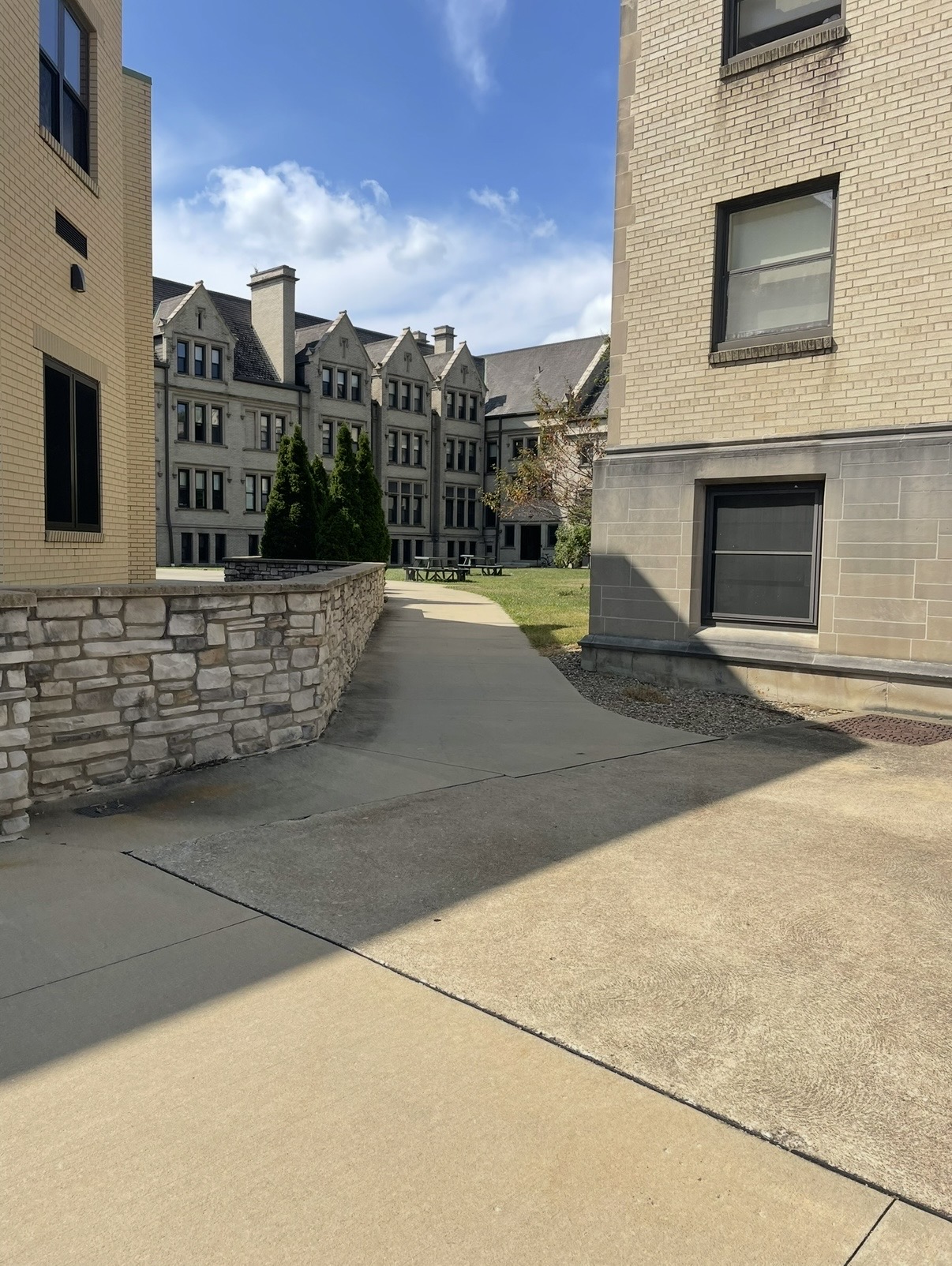
Gracyn Zerby, “Holden Hideaway”. 2026. CC BY-NC (Attribution-NonCommercial)
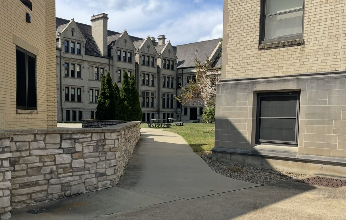
Gracyn Zerby, “Holden Hideaway”. 2026. Cropped on Canva. CC BY-NC (Attribution-NonCommercial)
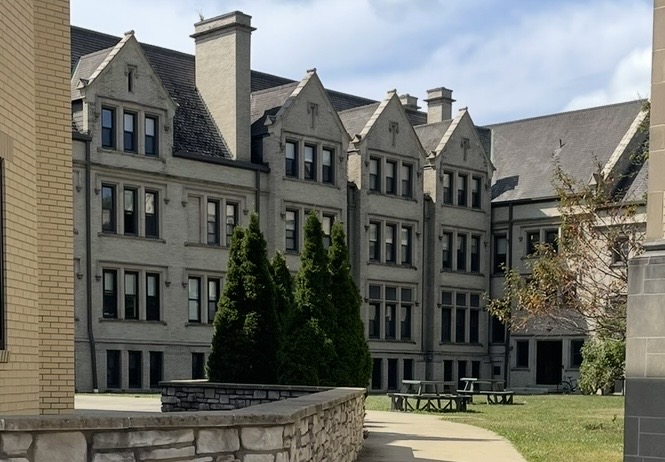
Gracyn Zerby, “Holden Hideaway”. 2026. Cropped and resized on Canva. CC BY-NC (Attribution-NonCommercial)