
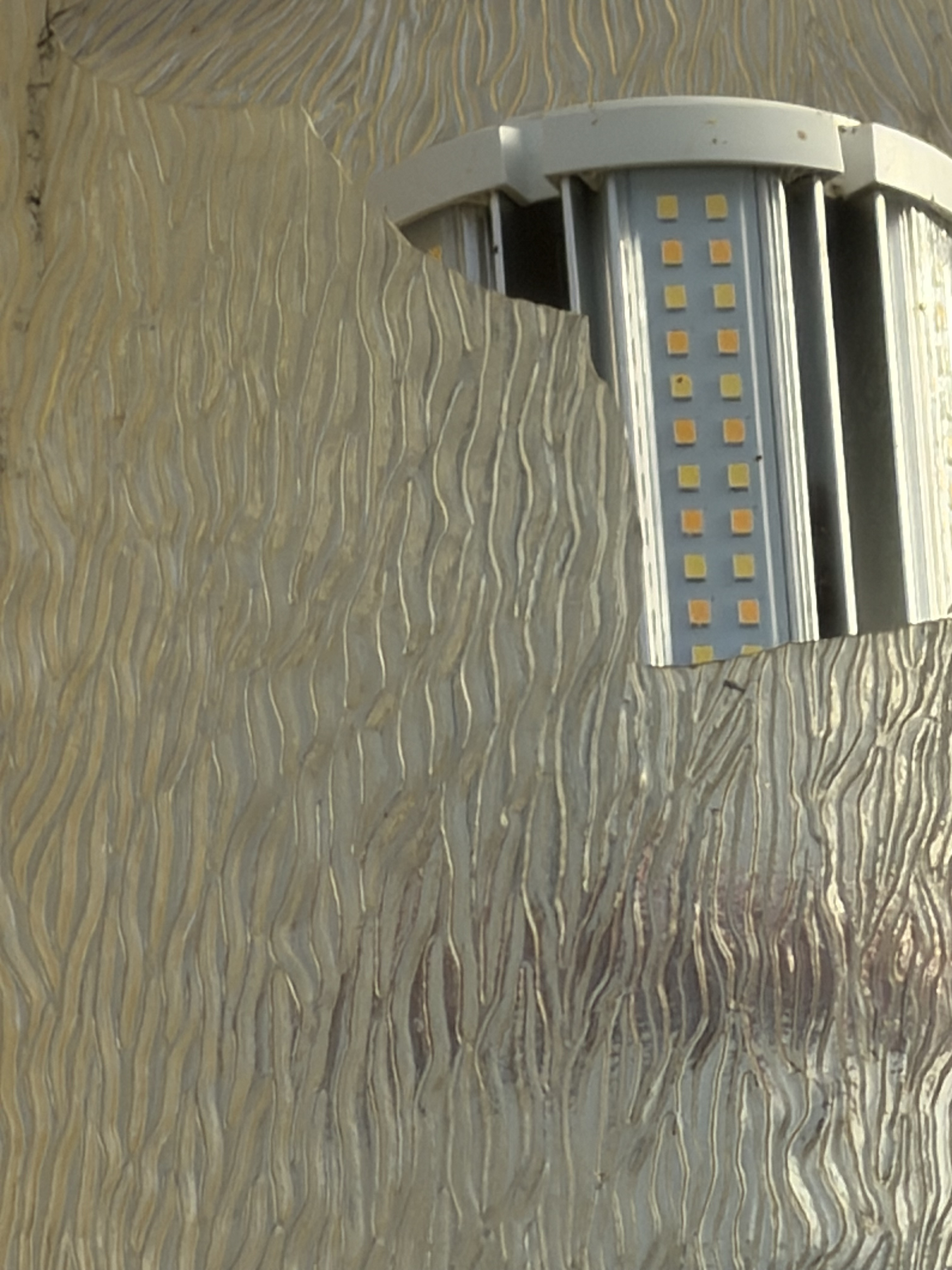
The first photo was of a broken lamppost that I chose as an abstract picture. I appreciated how the object itself still holds utility (by providing light) despite its broken state; hence the title “Fractured.”
Riechers details how “abstract photography gifts viewers with a new way of seeing the commonplace elements of everyday life, shifting the focus onto pure form rather than documentation of events or narrative” (Riechers 156). As such, I was hoping to implement interesting alterations that messed with the composition and viewer impressions of the photos.
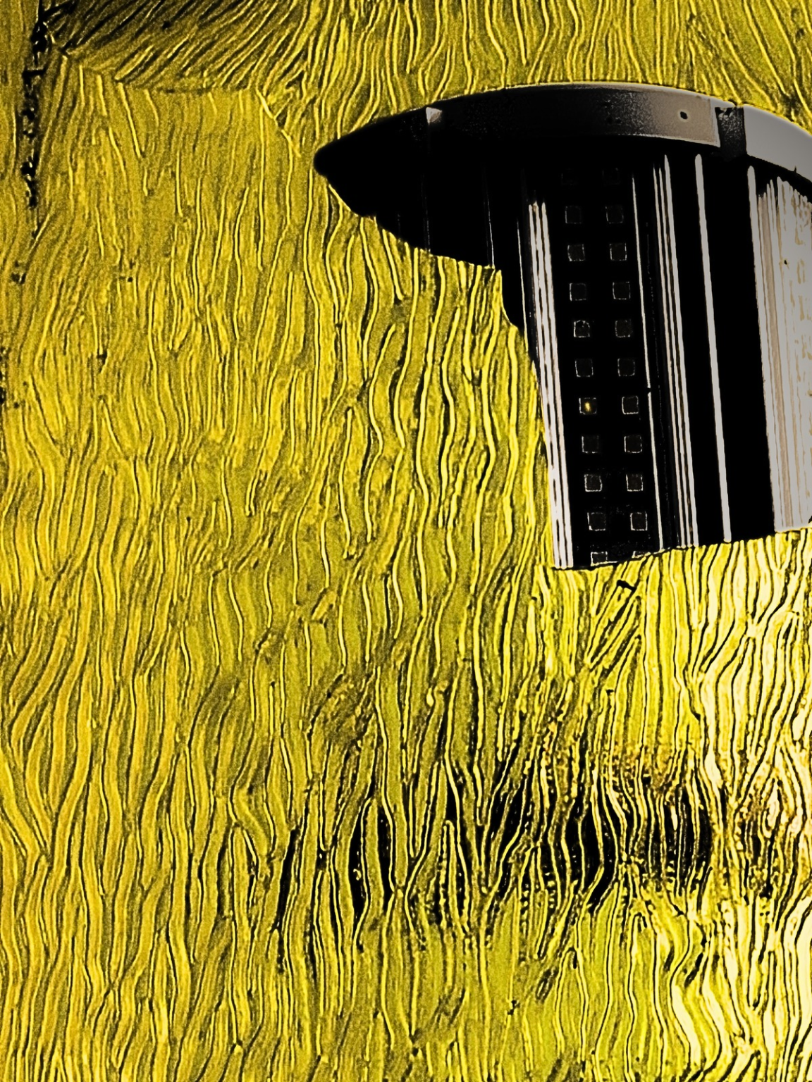
“Polar Lights” works as a play of words on the term [polar opposites]. I used various editing tools within Canva to emphasize this point. I wanted the light glass to be illuminated as it would appear normally at night, while also darkening the actual lighting component.
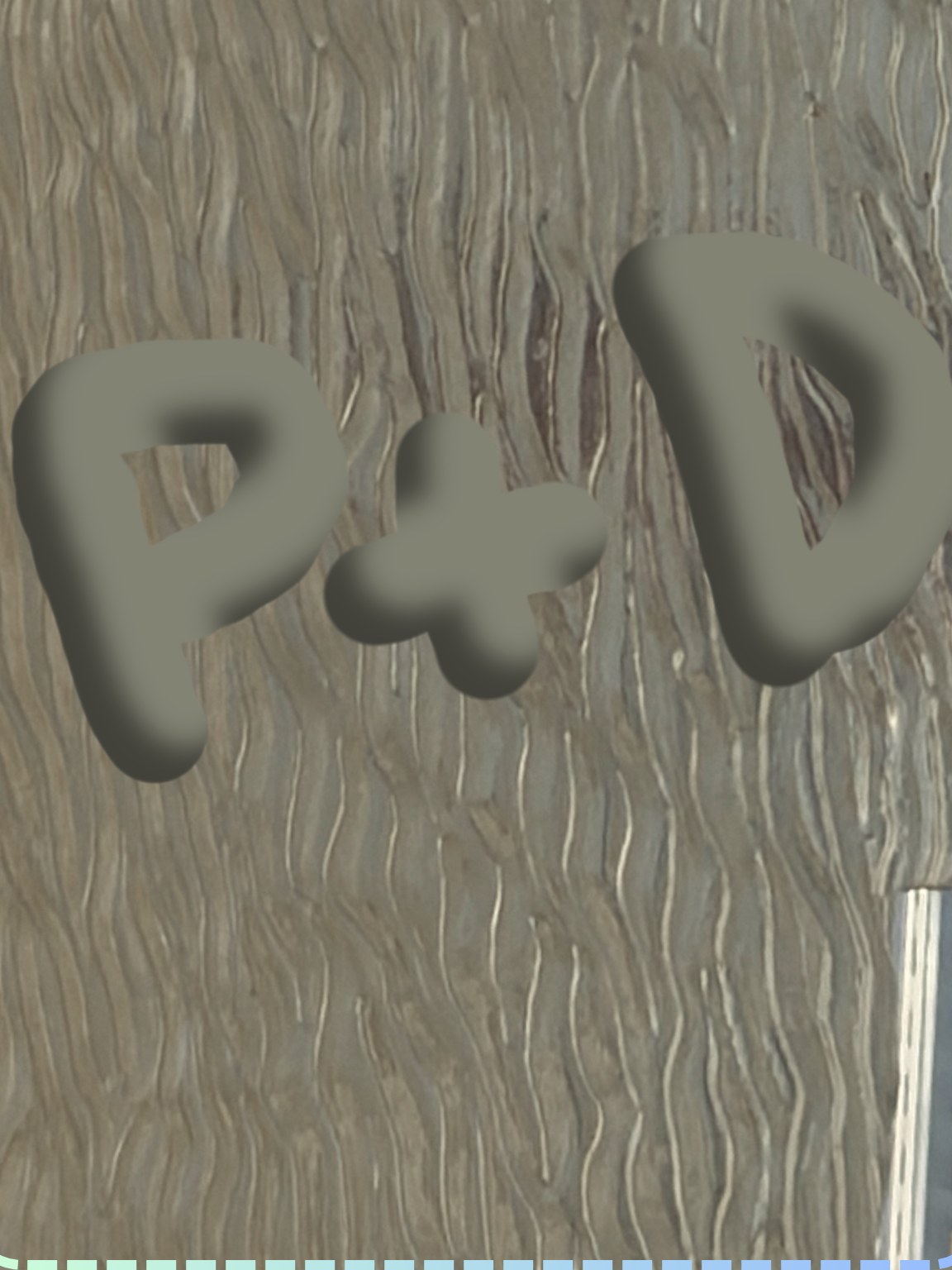
“Imprinted” was also created with the editing tools available in Canva. My main hope when approaching this design was for the photo to resemble an engraving within tree bark. I used the eraser tool specifically to put a pair of initials. I chose “Imprinted” as I feel it accurately represents most if not all humans’ need to be remembered, even if it is two initials in a simple tree.
Citations:
Duong, Pierce. “Fractured” (2026) DH class photo
Duong, Pierce. “Imprinted” (2026) DH class photo
Duong, Pierce. “Polar Lights” (2026) DH class photo
Riechers, A. (2024). Visual Grammar for Photography. In The Elements of Visual Grammar: A Designer’s Guide for Writers, Scholars, and Professionals (pp. 141–161). Princeton University Press. https://doi.org/10.2307/jj.6047949.10
AI statement: To my knowledge, I did not use AI. Although I used Canva for the majority of the editing, I do not believe there were any AI components used.
I like how you edited them and changed the name to reflect the thoughts behind them each. I also agree that the abstractness of each brings a new view as you linked to the reading.