
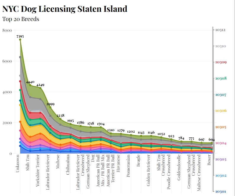
In this data set, we can see the most popular dog breed in the Staten Island Area. Flourish, the data tool I used to create this graph, was very straightforward. When I uploaded my spreadsheet with all the required information, it let me see the data laid out, but not in the most organized way. There are so many options to customize your work to your learning style or your audience’s learning style. At first, it was hard to read the information constructively because it was bunched up in one area, but after making customizations, I made it fit my particular style.
Process
My first step was to download the data given so I could upload it to the Flourish website. Then I had to decide what graph would represent the best information. I chose an area chart because it spread how my information in a way was visually appealing and easier to interpret. I first went for the bar chart, but it distributed the data in a way that was hard to read and uneasy to the eye, which is the opposite effect I wanted. The next step was to pick an enticing title so that my audience would want to learn more about the topic. Lastly, spent time looking through the different options Flourish provided and experimented with the way the data could be displayed.
Artifact
My artifact is a Flourish visualization showing dog breed data from the Staten Island area. My goal was to make the information from the original spreadsheet easier to compare and understand. The data includes many popular breeds, such as Shih Tzu, Yorkshire Terrier, Labrador Retriever, and Chihuahua, along with an “Unknown” category. Seeing the information visually made it easier to notice differences between the breeds than it was when I was looking at the original spreadsheet. I think I achieved my goal because I was able to take information that originally felt crowded and confusing and customize it into a visualization that is easier for me to understand and share with others.
Reflection
This project taught me that data visualization is not just about entering information into Flourish and letting the tool create the final product. I still have to make decisions about how the information should look and what will make the most sense to my audience. I learned that having many customization options can be helpful because different people may understand information in different ways. At the same time, too many options can make the process overwhelming at first. I also learned that I need to think about accessibility and how someone seeing the graph for the first time might interpret it. Next time, I would experiment with more designs before deciding on my final visualization.
Credits
Data provided as part of the course project. Visualization created using Flourish. Any screenshot included is my own work.
Declaration of AI Use: I used AI to help proofread and organize my writing. The ideas and experiences in this report are my own, and I reviewed the final version to make sure it still sounds like me and reflects my experience using Flourish.